As we know that, mobile devices are future of the internet technologies. With the increase of the mobile device usage, design techniques also changed. There are many different screen resolutions exist for each device, and therefore there is no way to make a design for each of them. Because of these constraints, new design methodology was born: Responsive Design.
In responsive design, designs are created for the mostly used dimensions, and for the other one software fits to mobile screen. Mostly used dimensions are 1024px (ipad landscape), 768px (ipad portrait), 480px (iphone landscape), 320px (iphone portrait). Designers create psd files for these sizes and developers code for all the other possibilities.
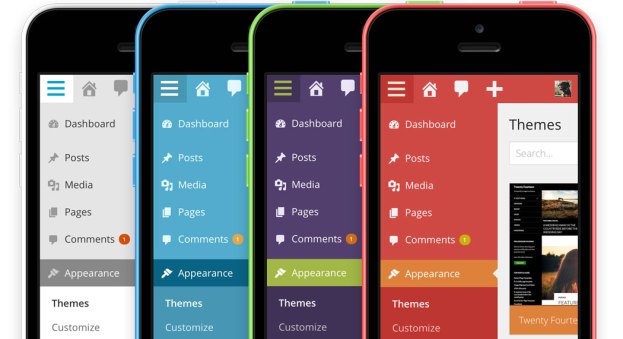
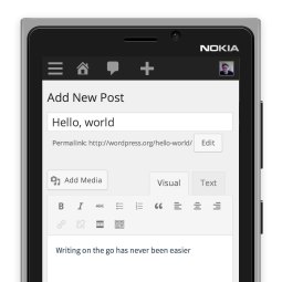
It is a new and more difficult design method. In last two years, websites started to have responsive websites. Instead of using a mobile version, two different web site; they prefer having one website which fits everywhere. Many front-end examples exist now. But WordPress version 3.8 has a big surprise. It has a responsive back-end design.
It is known that, WordPress is one of the mostly used CMS worldwide. Thousands of news posts, pages are created in a day by the WordPress websites, blogs. We all access the internet in different ways. Smartphone, tablet, notebook, desktop — no matter what you use, WordPress will adapt and you’ll feel right at home. With the new responsive admin interface, authors can continue publishing every where when they wi-fi/gsm network.
Another big feature of the WordPress 3.8 is Parker. It has eight different schemes for different user experiences. Color schemes can be previewed and changed from your Profile page. In coming days, we will see that new responsive admin page will increase the power of the WordPress or not.

Recent Comments