It’s interesting how much or how little a company’s logo can tell you about the company itself.
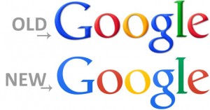
Google has demonstrated an across-the-board improvement in the design of its apps and services over the last few years. Their new logo reflects that, as it is simpler yet seems more professional than the one it replaces.

Yahoo is going through a vastly transformative period under the leadership of Marissa Mayer. As part of that change, the company unveiled an intriguing (if polarizing) new logo that feels both eccentric (differently sized “O”s!) and engineered.

While not a major change, removing the “gloss” effect and changing the font ever-so-slightly made Facebook’s logo cleaner than ever.

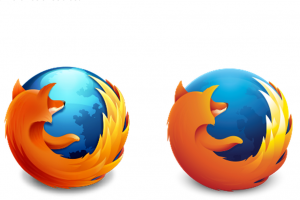
Following the simplification trend in the tech industry, Mozilla’s new Firefox logo retains the same overall form but strips out unnecessary details. Overall, it’s a big improvement (the fox’s arm no longer sticks out of its chest!)

YouTube has moved from a place to host videos for your friends to the place where video content of all forms can be hosted and distributed to gadgets of seemingly endless forms. Its new logo emphasizes the play button over the screen itself — showing the importance of content over medium.


Recent Comments